

How to paint your kitchen cabinets
/Thinking about a DIY kitchen makeover? Ready to update those dreary wood cabinets you’ve been meaning to paint ever since you moved in? Maybe you’re ready to add a bit of color to your kitchen. I think this winter is the perfect time for this kind of project. Perhaps you’re looking for a home project to keep you busy while waiting for the day we can all roam the earth freely. Here are some paint color ideas for your kitchen cabinets, but first a bit about preparation……
So if you decide to take on the task of painting your kitchen cabinets, the first thing to do is de-clutter. Since you have to remove all the contents anyway, it’s the perfect time to assess what you should keep and what you can let go of. Let’s face it, things tend to pile up in our kitchen cabinets and drawers. Now is the time to get rid of old pots and pans and old appliances that are stuck way in the back collecting dust. What about your kitchen utensils? do you really need seven spatulas? Go through every drawer and cabinet and make two piles, one to keep and one to donate. Don’t forget the dry foods in the cabinets, the ones that are way in back with expiration dates from the dark ages. No don’t donate those! you can compost.
Next up is the prep work. You’ll have to ask a pro or do your own on-line research on how to prep your kitchen cabinets for painting. Here is a helpful article from The Spruce that explains how to prep your cabinets depending on type of material, paint type, best paint finish and application tips.
Once you decide on a few paint options, get samples and tape to the cabinets. Leave the paint samples up for a few weeks, notice how the color looks during different times of day and under your specific lighting in the kitchen.
And lastly, make sure you select a paint that is low or no VOC (volatile organic compounds), which can be harmful when inhaled and may pose indoor air quality concerns. If you would like to read more about VOC to educate yourself, this page on the Benjamin Moore website is very helpful.

Source: Natasha Levak/Benjamin Moore Santorini Blue
One idea is to paint the upper cabs white and only add color to the lower cabs, good idea for a kitchen with a low ceiling or one that doesn’t get a lot of light. I couldn’t find the actual color that was used on these lower cabinets, so I selected Benjamin Moore Santorini Blue.

Source: Better Homes & Gardens/Benjamin Moore Polished Slate
I love the combination of this forest green color with the light herringbone floor and marble countertop/backsplash. Full disclosure, I couldn’t find the paint source so I selected Benjamin Moore Polished Slate.

Source: Frances Mildred Design/Farrow & Ball - Pigeon
If you’re looking for a soft calm color, Farrow & Ball Pigeon is pretty charming as done here by NY design studio Frances Mildred in their Park Slope project.

Source: Shapeless Studio/Benjamin Moore - Midnight Dream
Looking for a dark blue/black that changes color depending on the time of day and light? Shapeless studio selected Benjamin Moore Midnight Dream for this dreamy kitchen

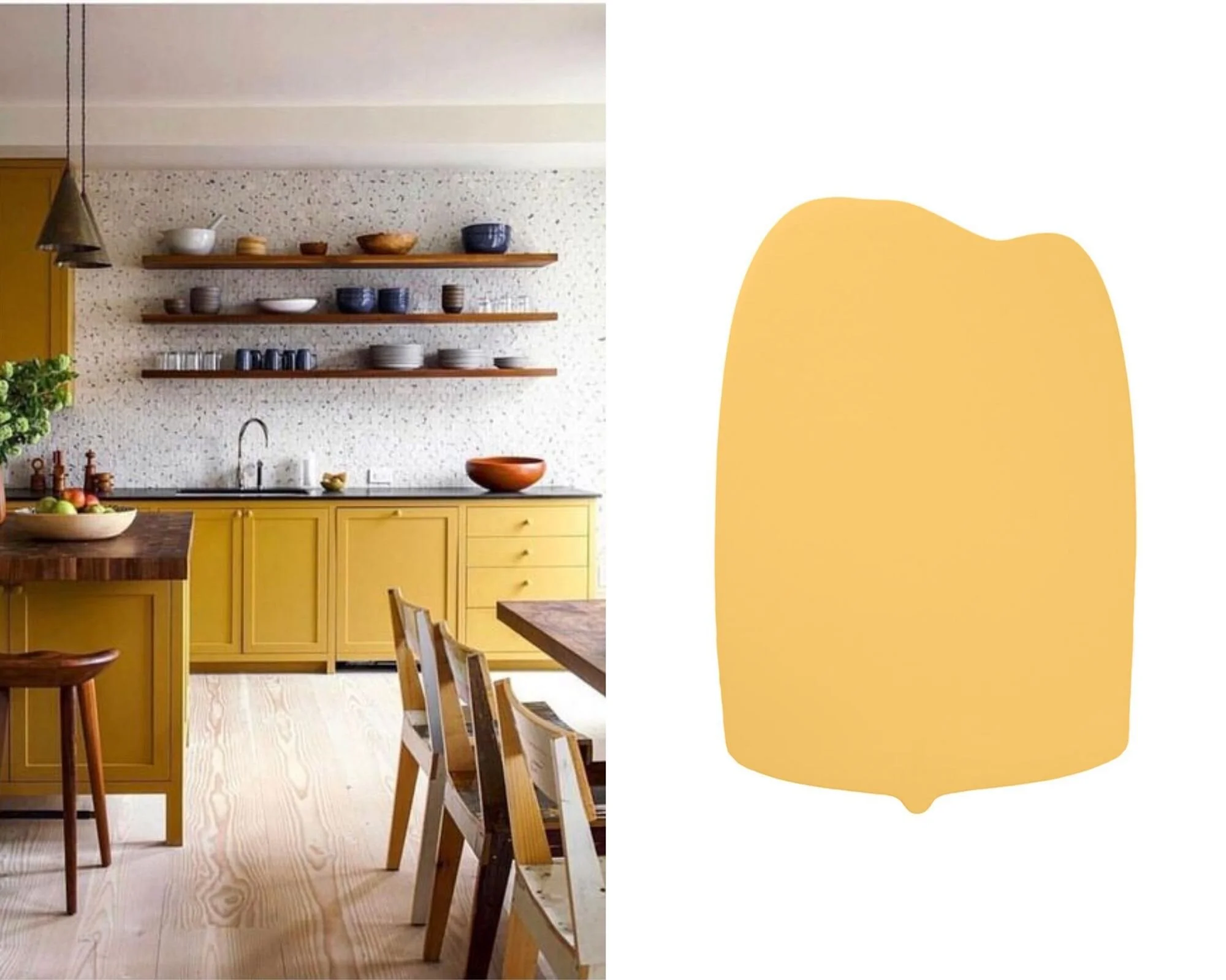
Source: Studio Scott/Clare Paint - Lemonade
Nothin happier than a yellow kitchen. The yellow really compliments the space combined with all the other light materials going on. I couldn’t find the color they used for these cabinets so my best match is Clare Paint Lemonade
Source: Remodelista. Farrow & Ball Stiffkey
If your looking for a soft medium blue, you can’t go wrong with Farrow & Ball Stiffkey Blue

Source: The Nordroom/Clare Paint - Dirty Martini
This touch of mint green is the perfect compliment to this minimal scandi kitchen. I couldn’t find the color The Nordroom used here so I made my best match with Clare Paint Dirty Martini (don’t you love the name?)

Source: Ark Studio/Clare Paint - Nairobi Blue
Can you get more charming than this? I think not….oh and of course it’s in Lisbon. This kitchen, designed by Ark Studio is calm, crisp and serene. My color match for the cabinets is Clare Paint Nairobi Blue

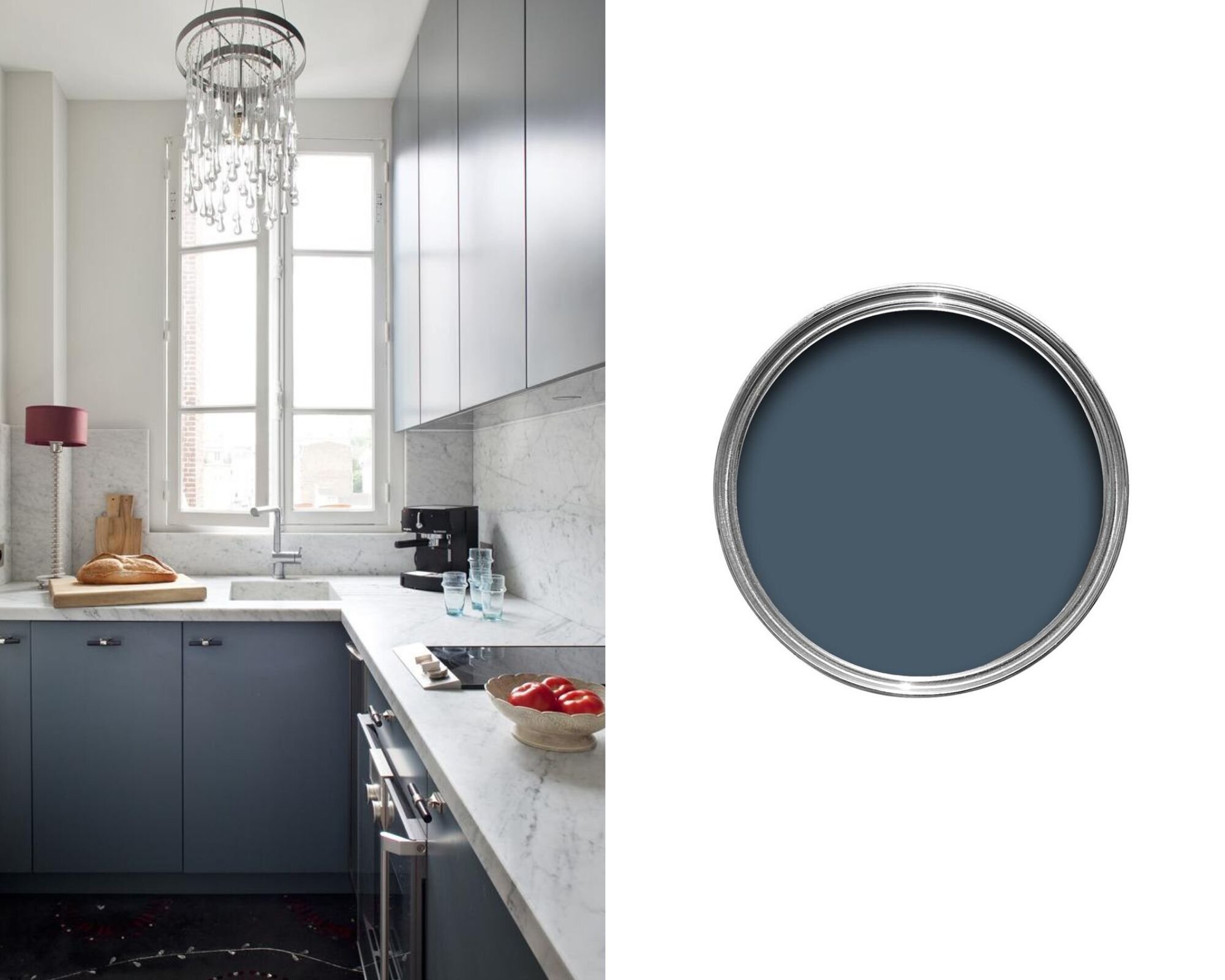
Source: Elizabeth Roberts Architect/Bemjamin Moore - Silent Night
The paint color Elizabeth Roberts used for these cabinets is Benjamin Moore Silent Night. I actually have this color on my bedroom wall and I can tell you I’m in love with it. The color changes during the day, sometimes it more gray and other times it’ s more blue depending on the light. Either way it’s super calming.
Source: Casa Vogue/Clare Paint - Golden Hour
This is a pretty bold move but done right with all the other elements working here. This is a deeper yellow, almost mustard, my color match is Clare Paints Golden Hour
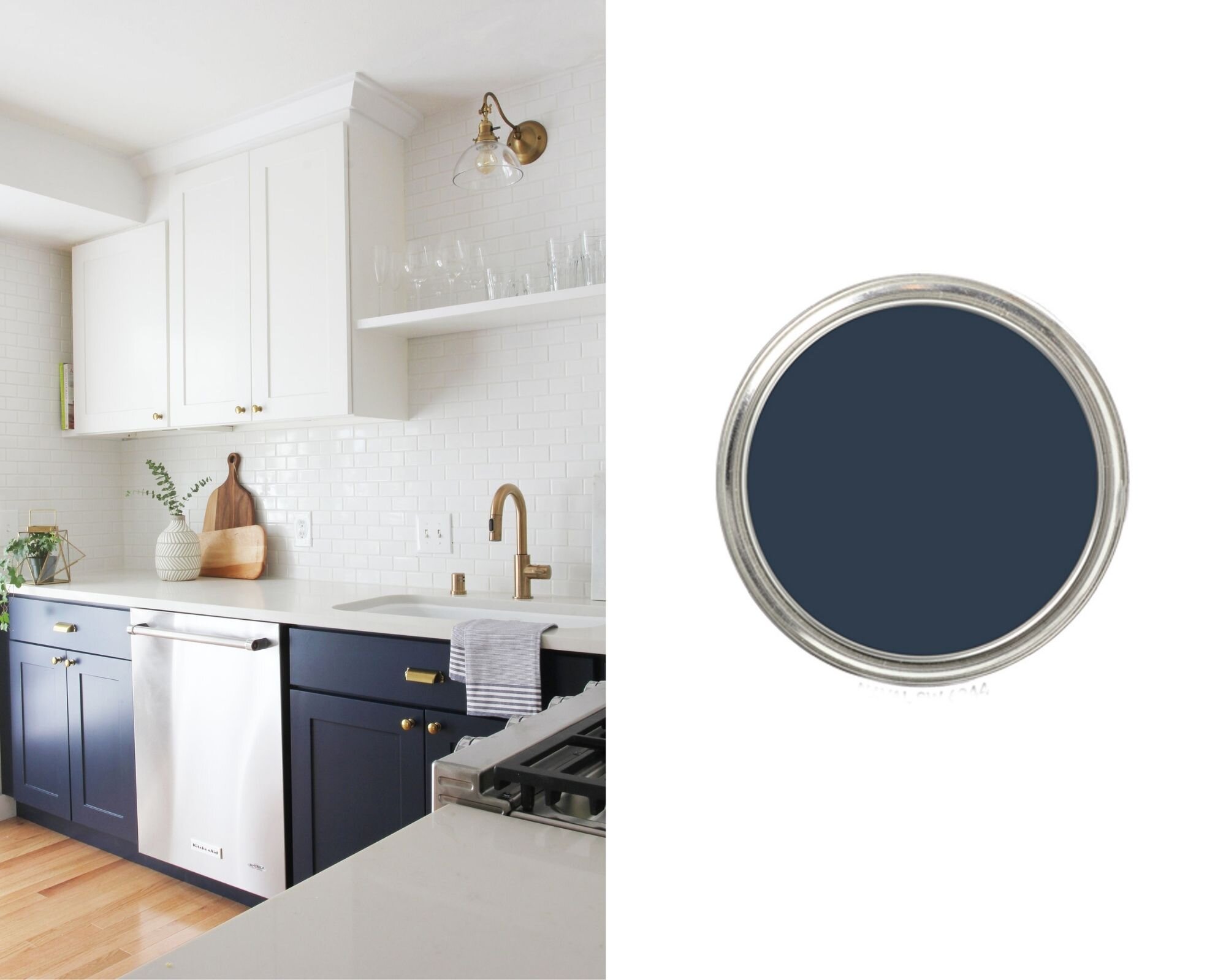
The Grit & Polish/Sherwin Williams Naval
Looking for a navy blue? Look no further than Sherwin Williams Naval

Source: Neal Beckstedt/Farrow & Ball - Setting Plaster
Farrow and Ball describes this color as a dusty plaster pink. I think Neal Beckstedt Studio rocks the pink in this cool kitchen. Hats off to a pretty bold move.
